

Panels
Most eDrawings WebGL panels are associated with side menu items to explore the assembled model by components, configurations, section, measuring, parts parts in exploded and moving a part around away from the model.
| Components | ||
|---|---|---|
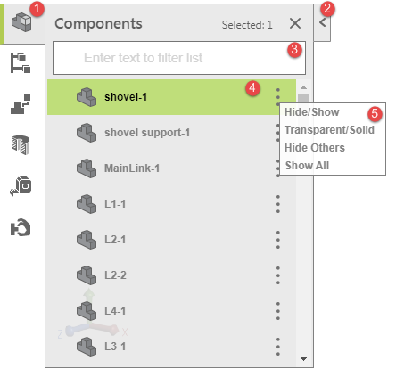 |
Components panel lists out all the components of the modal. It has the visual parts of 1) Header, 2) Collapse button, 3) Search Filter input, 4) Component selected, and 5)Popover for component view status. The panel box size is specified as position: absolute; width:300px; height: 100%; background-color: rgba (232 232 232 0.9); border: 1px solid gray (#808080). Components can be multi selected. | |
1 |
Panel Header: height: 41px; line-height: 41px; title margin left: 10px; margin-right: 10px; font-family: "Segoe UI"; font-size: 17px; font-weight: 600; text-align: left; color: #5b5b5b; components count font-size: 12px; right: 45px; top: 2px. | |
2 |
Panel collapse button width: 16px; height:41px; border: 1px solid rgba (140 140 140 1.0); line-height: 44px; vertical-align: middle; background-color: rgba(232, 232, 232, 0.9) | |
3 |
Search filter input box: margin-left: 0px; margin-right: 8px; margin-bottom: 5px; border: 1px solid #757575; background-color: #ffffff. | |
4 |
Mouse click to select the component and the selected item is highlighted in green color rgba (149, 211, 11, 0.5) and the component list row height: 40px; line-height: 40px; vertical-align middle; color: #828282. | |
5 |
The vertical ellipsis is clickable icon to open the popover with the options of selected component(s) view mode. The Popover box size: 120x80px; border: 1px solid #808080; background-color: #ffffff; color: #828282; font-size: 12px; font-weight: bold. | |
| Configurations | ||
|---|---|---|
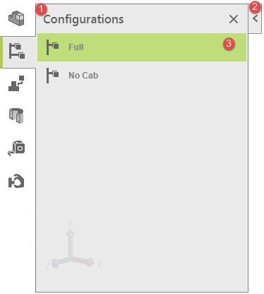 |
Configuration panel shows the list of configurations. It has the visual parts of 1) Header, 2) Collapse button, 3) Configuration list. The panel box size is specified as position: absolute; width:300px; height: 100%; background-color: rgba (232 232 232 0.9); border: 1px solid gray (#808080). | |
1 |
Panel Header: height: 41px; line-height: 41px; title margin left: 10px; margin-right: 10px; font-family: "Segoe UI"; font-size: 17px; font-weight: 600; text-align: left; color: #5b5b5b. | |
2 |
Panel collapse button width: 16px; height:41px; border: 1px solid rgba (140 140 140 1.0); line-height: 44px; vertical-align: middle; background-color: rgba(232, 232, 232, 0.9) | |
3 |
Mouse click to select the configuration and the selected item is highlighted in green color rgba (149, 211, 11, 0.5) and the configuration list row height: 40px; line-height: 40px; vertical-align middle; color: #828282. | |
| Explode | ||
|---|---|---|
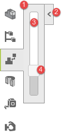 |
Explode panel has a slider bar with a button at the bottom, move the button up to decompose the model into pieces. | |
1 |
Explode panel box: 44x204px; border: 1px solid gray (#808080), background-color: rgba(232,232,232, 0.9) | |
2 |
Panel collapse button width: 16px; height:41px; border: 1px solid rgba (140 140 140 1.0); line-height: 44px; vertical-align: middle; background-color: rgba(232, 232, 232, 0.9) | |
3 |
Slider bar size: 17x170px; margin: 15px 12px; border: 1px solid #a2a2a2; background: #ffffff; border-radius: 4px; padding-left: 2px; | |
4 |
Slider bar button: 1.2 x 1.2em; background-color: #f6f6f6; border: 1px solid #c5c5c5; border-radius: 4px; slider-range background-color: #cccccc. | |
| Section | ||
|---|---|---|
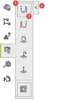 |
Section panel shows 6 options to explore the model in segment view for: 1) X/Y Plane, 2) Y/Z Plane, 3) X/Z Plane, 4) Flig, 5) View the from Section Plane, and 6) Enable Capping. X/Y Plane and Enable Capping options are pre-selected by default. | |
1 |
Section panel size: 57x315px; background-color:rgba(232,232,232, 0.9); border: 1px solid gray (#808080); padding: 2px; text-align: center. | |
2 |
Panel collapse button width: 16px; height:41px; border: 1px solid rgba (140 140 140 1.0); line-height: 44px; vertical-align: middle; background-color: rgba(232, 232, 232, 0.9) | |
3 |
Option selected is highlighted with a bordered box: size: 40x30px; background-color: rgba(232,232,232, 1.0); border: 1px solid rgba (140, 140, 140, 1.0). | |
| Measure | ||
|---|---|---|
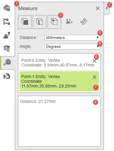 |
Measure panel has features to assess the modal component/parts by 1) Face, 2)Edge 3) Vertex, 4) XYZ Measurements, and 5) Point-to-Point measurement. The Face, Edge and Vertex are preselected by default. The measurement can also be configured with distance by seleting the 6 different unit options of 1) Millimeters, 2) Centimeters, 3) Meters, 4) Inches, Feet, and 5) Feet and Inches. The default value for Distance option is Millimeters. The Angle has 2 options for 1) Degrees, and 2) Radiants. The Angle default option value is Degrees. Panel is specified as width: 300px; left: 50px; top:50px; bottom:52px; margin: 0 auto; background-color: rgba(232,232,232, 0.9); border: 1px solid rgba (140,140,140 1.0); padding: 0px; font-family: Arial; font-size: 14px; color: #5b5b5b; overflow-x: hidden; overflow-y: hidden. | |
1 |
Panel Header: height: 41px; line-height: 41px; title margin left: 10px; margin-right: 10px; font-family: "Segoe UI"; font-size: 17px; font-weight: 600; text-align: left; color: #5b5b5b. Panel Close button using image icon ans is specified as background-image: rul(../edrawings_icons/cross.png); background-repeat: no-repeat; position: absolute; size: 20x20px; top:11px; right:10px. | |
2 |
Panel collapse button width: 16px; height:41px; border: 1px solid rgba (140 140 140 1.0); line-height: 44px; vertical-align: middle; background-color: rgba(232, 232, 232, 0.9) | |
3 |
Measure filter show the option icons of 1) Face, 2)Edge 3) Vertex, 4) XYZ Measurements, and 5) Point-to-Point measurement. Edge and Vertex are preselected by default and they are highlighted with bordered box at size of 44x44px; margin: 4px 10px; line-height: 44px; background-color: rgba(232,232,232, 1.0); border-color: 1px solid rgba(140, 140, 140, 1.0); text-align:center; | |
4 |
Measure unit row has items of unit name and unit selector: unit row margin: 10px; unit item: height: 30px; line-height: 30px; unit name: display: inline-box; margin-left: 6px; width: 80px; text-align: left; vertical-align: middle; font-family: Arial; font-size: 14px; font-weight: normal; lable line-height: 20px; text-shadow: 0 -1px rgba(0,0,0, 0.2); font: 14/18px 'Helvetca Neue-Light', Helvetica Neue', Arial, Helvetica, sans-serif. Unit selector size: 190x19px; background-color: #ffffff; border: 1px solid rgb(169,169,169); vertical-align: middle. Select value font: 400; 13px Arial; color: #585858. | |
5 |
Measure Angle row has items of unit name and unit selector: unit row margin: 10px; unit item: height: 30px; line-height: 30px; unit name: display: inline-box; margin-left: 6px; width: 80px; text-align: left; vertical-align: middle; font-family: Arial; font-size: 14px; font-weight: normal; lable line-height: 20px; text-shadow: 0 -1px rgba(0,0,0, 0.2); font: 14/18px 'Helvetca Neue-Light', Helvetica Neue', Arial, Helvetica, sans-serif. Unit selector size: 190x19px; background-color: #ffffff; border: 1px solid rgb(169,169,169); vertical-align: middle. Select value font: 400; 13px Arial; color: #585858. | |
6 |
Measure message box: width: 280px, min-height: 50px; overflow-y: auto; background-color: #ffffff; border: 1px solid rbg(140, 140, 140); margin: 10px; padding: 2px; message input data value: margin: 2px; padding: 10px 6px. | |
7 |
The last input data value is highlighted in green (#cae985), the highlight will disappear once the mouse pointer moves away from the picked measurement on the model. | |
8 |
Measure result message box: size: 280x172px; background-color: #ffffff; border: 1px solid: rgba(140,140,140); padding: 10px 6px; overflow-y: auto. | |