

Menu
eDrawings WebGL has navigatable menu on the top right, at the left side and bottom. The top menu is to view the modal in different settings, orientation and display mode. The side menu is to open a panel and explore the assembled model by components, configurations, section, measuring, parts parts in exploded and moving a part around away from the model. Some of the menu icon items has sub-menu popover for more action selections.
1. Top Menu Bar
| Main-Level 1 | |
|---|---|
 |
The top menu bar in default status on a large desktop screen. It has 8 action icons for 1) Reset, 2) Animate View, 3) Zoom to Fit, 4) View Settings, 5) View Orientation, 6) Display, 7) Help, 8) Fullscreen. |
 |
Partially hide menu bar items on a small screen size device or the browser screen is resized to a certain break point view when the screen width is not big enough to show all the menu icons. Clicking or tapping on the right arrow icon, the menu is scrollable to left and show the hidden icons at the right end. |
 |
On a small size device or a browser window that is not big enought to show all the top menu icons, when the menu is scrolling to the left and menu icons items can be hidden from both side. In this case, the arrow icons will show up on both side of the menu. |
 |
On a small size device or a browser window that is not big enought to show all the top menu icons, once the menu is scrolling to right and show the hidden icons at the right side, the icons at the very left side will be hidden and left arrow icon shows up. |
 |
Top menu bar for drawing file. |
| Sub-Level 2 | |
|---|---|
 |
View Settings When clicing/tapping on the "View Settings" icon, it is highlighted with a highlight box (size: 47x47px; background-color:#E9E9E9; border-top: 4px solid #A7CC45; border-left/right/bottom: 1px solid #8D8D8D;) and it opens the sub-menu with 2 view-mode selections for 1) Ambient Occlusion, and 2) Perspective. The submenu has the same visual setting for background color and border. |
 |
Once a selection is picked, the submenu will be disappeared but the system will cache the selection, and once the "View Settings" is clicked again, a bordered box (size: 40x40px; border: 1px solid #8C8C8C;) shows up to higlight the selection. |
 |
"View Settings" can have 2 selections choosen at the same time. |
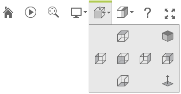 |
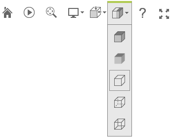
View Orientation When clicking/tapping on "View Orientation" icon, it is highlighted with a highlight box (size: 47x47px; background-color:#E9E9E9; border-top: 4px solid #A7CC45; border-left/right/bottom: 1px solid #8D8D8D;) and it opens the sub-menu with 7 view-mode selections for 1) Top, 2) Isometric, 3) Left, 4) Front, 5) Right, 6) Back, and 7) Bottom. Each selection will turn the model to the selected orientation side. The submenu has the same visual setting for background color and border. |
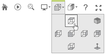 |
When move the mouse to point to any selection, it has a hover status and show a box (size: 40x40px; background-color: #F3F3F3; border: 1px solid #000000) to highlight the selection. Once the selection is picked the sub menu will disappeared and the selection is not cached by the system. |
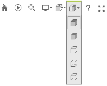 |
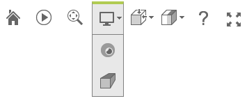
Display When clicking/tapping on "View Orientation" icon, it is highlighted with a highlight box (size: 47x47px; background-color:#E9E9E9; border-top: 4px solid #A7CC45; border-left/right/bottom: 1px solid #8D8D8D;) and it opens the sub-menu with 5 view-mode selections for 1) Shaded With Edges, 2) Shaded, 3) Hidden Lines Removed, 4) Hidden Lines Visible, 5) Wireframe. The "Shaded With Edges" is the default selection with a hilighted box (size: 40x40px; border: 1px solid #8C8C8C;) The submenu has the same visual setting for background color and border. |
 |
The new selection is cached by the system. |
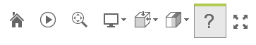  |
When clicking on Help icon, it popus the help panel in the center of the content body on top of the model. The Help icon is highlighted with a box (size: 47x47px; background-color:#E9E9E9; border-top: 4px solid #A7CC45; border-left/right/bottom: 1px solid #8D8D8D;) to indicate the active mode. The help panel is an image file. |
2. Side Menu Bar
| Main-Level 1 | |
|---|---|
 |
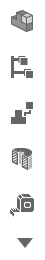
The side menu bar in default status on a large desktop screen. It has 6 action icons for 1) Components, 2) Configuration, 3) Explode, 4) Section View, 5) Measure, and 6) Move. They are clickable icons to open a panel and explore the assembled model by components, configurations, section, measuring, parts parts in exploded and moving a part around away from the model. |
 |
Partially hide menu bar items on a small screen size device or the browser screen is resized to a certain break point view when the screen height is not all enough to show all the menu icons. Clicking or tapping on the bottom arrow icon, the menu is scrollable to top and show the hidden icons at the top end. |
 |
On a small size device or a browser window that is not big enought to show all the top menu icons, and when the menu is scrolling to the top and menu icons items can be hidden from both side. In this case, the arrow icons will show up on both top and bottom of the menu. |
 |
On a small size device or a browser window, once the menu is scrolling to top and show the hidden icons at the bottom, the icons at the very bottom will be hidden and top up icon shows up. |
|
On a small size device or a browser window that is not big enought to show all the top menu icons, and when the menu is scrolling to the top and menu icons items can be hidden from both side. In this case, the arrow icons will show up on both top and bottom of the menu. |
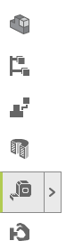 |
If a multi-action icon item is picked, it popups a panel. It is highlighted with a full size box (size: 47x47px; background-color:#E9E9E9; border-left: 4px solid #A7CC45; border-top/right/bottom: 1px solid #8D8D8D;) and A help size box (size: 20x40px; background-color:#E9E9E9; border: 1px solid #A7CC45;) with a angle-right icon that indicates its active mode. |
 |
If a single action icon item is picked, it won't popup a panel. It is highlighted with a box (size: 47x47px; background-color:#E9E9E9; border-left: 4px solid #A7CC45; border-top/right/bottom: 1px solid #8D8D8D;) that indicates its active mode. |
 |
Side menu bar for drawing file that has 3 action items for 1) Sheets, 2) Layers and 3) Measure. They are clicakable actions to popup the feature panels. |
 For side menu popup panels, see the styling info on the Panels page. For side menu popup panels, see the styling info on the Panels page.
|
|